
 NZBC linked to a recent Slate piece in which a gaggle of writers discuss their favorite fonts to work in.
I’m a heavy Times user myself, mainly because it’s the only font that doesn’t distract me while I’m working in it — to me it just looks plain and neutral without being hard to read. (I’d upgrade to Times New Roman if I thought about it, but since Times is the default in Word I usually just roll with it.)
I can’t work in sans serif fonts — they give me a headache. This can be difficult because a lot of my business clients gravitate toward Arial and other sans serifs, thinking that they’re “simple” and “clean.” (The reality, of course, is that while sans serifs are great for headlines and decorative type, when you’re working with large blocks of body text, you need the serifs to help the eye track the line. Reading comprehension goes down when you set long passages in sans serif fonts. It’s a shame that basic typographical fact of life isn’t more widely understood, but don’t get me started.)
Courier (the choice of a number of the “old school” writers sampled) always looks to me like you’re pretending to write on a typewriter rather than actually doing so. (Ditto for American Typewriter, though I think it looks nice on the OcPot masthead.)
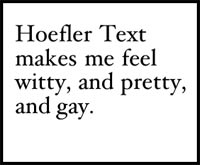
I do like Hoefler Text a lot, which one of the writers chose, but it’s more something I’d choose to set writing in after I’d already written it. I tried working in it for a while, but found it far too pretty to let me concentrate. It kept making me think about whether what I was writing was elegant enough for the font or not. Who needs that kind of pressure?
Previously on Ocelopotamus:
• Happy Fontiversary Helvetica, All About Arial, and Cooper Black: Behind the Typeface
I like ARIAL because all these serifs slow me down!
I like sans-serif fonts because the serifs tear at my stomach lining.